Saturday 25 October 2014
Saturday 9 August 2014
summer school and GTS - a very busy(and fun) week
Wow!! what a blast the last two weeks have been. As you know in march I completed the ABSPD module 1 course and since have been working hard creating patterns. Well I also signed up for Summer Camp. I have enrolled on all three routes (beginner, intermediate and advanced). This time round I only managed to complete the beginner and intermediate routes although I did work on the advanced I didn't manage to create anything I was truly happy with.
So what is summer camp? Well every two weeks we get a professional style brief. All three were following the megatrend of impulse which is current for spring summer 2015. The beginners brief was much more like what I normally design so this came together faster as I was much more confident in this area. All three were following the megatrend of impulse which is current for spring summer 2015. We were given the theme of tropical paradise.With imagery, keywords and prompts, the lovely team at Make it in design (MIID) had prepared the perfect starting point. I decided to go for tropical fruit and incorporated stripes.
Here is my work (centre) along side some other artists participating. I love how we all interpreted the theme in our own style.


So what is summer camp? Well every two weeks we get a professional style brief. All three were following the megatrend of impulse which is current for spring summer 2015. The beginners brief was much more like what I normally design so this came together faster as I was much more confident in this area. All three were following the megatrend of impulse which is current for spring summer 2015. We were given the theme of tropical paradise.With imagery, keywords and prompts, the lovely team at Make it in design (MIID) had prepared the perfect starting point. I decided to go for tropical fruit and incorporated stripes.
 |
| Taken from http://makeitindesign.com/ |
I wanted to include influences from these beautiful Horrocks' dresses that I was lucky enough to see on a recent visit to the Fashion and Textile museum in London.
For the intermediate brief we were given the theme of retro geometrics. A little out of my comfort zone as I have not really included many geometrics in my designing. Nostalgia and interlocking along with a nod to tropical fruit I went for a watermelon inspired theme but then in my final piece adapted it to a more retro and modern colour palette. I have included both as a sneaky peak at the design process, and a glimse of some of the other interpretations of this theme.
 |
| Taken from http://makeitindesign.com/ |
I was unable to complete the third brief with the theme of water rays, and more on the reason for this to come below. I strongly advise you to check out all three of the galleries on the MIID site. So many talented artists and stunning patterns.
Well the reason for not completing the final piece was that Global Talent Search started on Tuesday. I initially was not sure about entering- as is the case for so many artists- but felt that it was best to be brave.Well I have submitted my design this morning and now there is no more that I can do with this piece. I am very proud of this work and hope to share it with you soon. Wish it luck
 |
| taken from http://lillarogers.com/ |
Sunday 27 July 2014
Herb Garden
This weeks Spoonflower contest is all about the herb garden. I have always loved growing herbs since i picked up a book on traditional herb gardens when I was in high school.Chives, basil, sage and rosemary have always featured in my garden and my front garden is full of lavender.
But more recently I have been interested in herbal teas. Camomile and Honey being one of my favourites. It is with this in mind that I produced the pattern below. If you like it you can vote for it here. It will also be made for sale soon and in two other colour ways - chic yellow and grey and a serene blue and green

But more recently I have been interested in herbal teas. Camomile and Honey being one of my favourites. It is with this in mind that I produced the pattern below. If you like it you can vote for it here. It will also be made for sale soon and in two other colour ways - chic yellow and grey and a serene blue and green
Also - Summer School starts this week. There are three different levels from beginner , intermediate and advanced . Each will have a new brief every two weeks. It going to be lots of fun. I'm really looking forward to seeing how everyone interprets the themes. Summer school lasts for 6 weeks and is completely free. If you haven't signed up yet follow this link and I will see you there.
Wednesday 16 July 2014
Exciting times

Firstly a big thank you to you.
Thank you for all the encouraging comments and support I have been receiving. If you want to you can also contact me through Facebook. (I will have my social media buttons up and running soon.) In the meantime, follow the link and say hello. If you like my page you will the first to hear about further instalments from the blog along with other news.
Why not Rhino's?
Spoonflower last week was all about fishing lures - well not feeling too inspired I gave that one a miss. Others however came up with some stunning designs. Which can still be seen on the front page. This week it is all about rhinos. Safari themed prints commonly have elephants and lions but its not that often that you see a rhino. However, there are herds of them at Spoonflower this week including my own design. I wanted to create a design which had scenes, was fun and vibrant and could be used for the quilting market.
A bit of coordination

I wanted to show some fabric samples of this design. I am UK based so my Spoonflower samples will take a while to travel from USA but I have had some made up at the UK fabric printers, Print me Pretty and what's really great is that because the samples came out so well, they have now been made available to buy. If you are based in the UK, this is brilliant as it is much faster and there is no chance of the customs import charges. They are currently available in two types of cotton . I also created two coordinates and all three are now available. I hope to have two further colour ways available soon both on Spoonflower and Print me Pretty.
Voting
There is still a little time to vote. So I advise you head over there and share some love to these beautiful creatures. If you are not into crafting but still would like this design head over to Society6 where I have made it available on some different products. My favourite is the bag.

Fabric8
On Friday the 8 finalists of the Spoonflower/Kaufman Fabric8 competition unveil their coordinating designs and we get to vote this year winner. I would definitely recommend checking them out as these are some very talented designers and I'm personally looking forward to see how they develop their designs.
Friday 4 July 2014
20 ways to doodle- mini book review

Rachael has chosen 45 themes as a launch point to doodling. You could ask why would you need a book to teach you how to doodle but then your missing the point. It a beautiful reference guide to many different styles of doodling. I know that when I'm just doodling I always fall into similar themes and styles.
The book also encourages the use of different media to get different effects and most importantly to keep your work and refer back to it for inspiration. I have found it useful to flick through until something catches my eye and then use this as a place to start. Thank you Rachael for the book I know I will be referring to this a lot in my designing.
Friday 27 June 2014
Sewing Notions

This week I entered the Spoonflower Contest. The brief asked for a design on the theme of sewing notions. This is something I love as when I'm not designing I am dressmaking. This contest was a bit different from the usual as it required not one but four designs set up as fat quarters shown as a yard. Perfect really as this contest has a guest judge Denyse Schmidt and the top 10 will be featured in Love Patchwork & Quilting!
Voting is open now so please follow the link and vote for your favourites.
Saturday 7 June 2014
June already
This past month I entered two competitions. The Tigerprint monthly competition with the theme Kids Character and Spoonflower's annual Fabric8 competition.
For Tigerprint the brief asked for a birthday card design for an 8-12 year old boy or girl. It needed to be age appropriate and to appeal to the adults buying the card. The most important part of this process for me was the research. I am really new to greetings card design so I really looked into what was about. I was really surprised of the lack of boys birthday cards for this age group. Most boys birthday cards were images based upon toys or cartoons. I also tried out some new techniques and styles. I think my favourite is the camping.

The second competition was the Spoonflower & Robert Kaufman competition Fabric8, this is an annual competition for new and emerging designers. The prizes are really cool, with the winner getting a contract to design a fabric collection for Robert Kaufman Fabrics. This years theme was Cosmic Voyage. I wanted to go for a mid century modern cats is space feel. I also think I will be making a dress with this material as I really think the colours will work well. I am waiting for the swatch to come and then this will be up for sale soon.

For Tigerprint the brief asked for a birthday card design for an 8-12 year old boy or girl. It needed to be age appropriate and to appeal to the adults buying the card. The most important part of this process for me was the research. I am really new to greetings card design so I really looked into what was about. I was really surprised of the lack of boys birthday cards for this age group. Most boys birthday cards were images based upon toys or cartoons. I also tried out some new techniques and styles. I think my favourite is the camping.
The second competition was the Spoonflower & Robert Kaufman competition Fabric8, this is an annual competition for new and emerging designers. The prizes are really cool, with the winner getting a contract to design a fabric collection for Robert Kaufman Fabrics. This years theme was Cosmic Voyage. I wanted to go for a mid century modern cats is space feel. I also think I will be making a dress with this material as I really think the colours will work well. I am waiting for the swatch to come and then this will be up for sale soon.
Friday 2 May 2014
Its not over, it's just the beginning
So week 5 and the final week of the brilliant Module 1 of the course. Firstly a very big thank you to Rachael Taylor and Beth Kempton for producing and developing such an amazing, inspirational and supportive course. I have had so much fun on the course (The art and business of surface pattern design) and it has really made me think about the possibilities ahead. Exciting times.
Secondly the course would not have been half as much fun if it hadn't been for the fabulously talented Facebook group who I enjoyed the course with, thank you to anyone who has liked or commented on a post, pattern or idea that I put out there. You have helped me to be brave. I also look forward to following your progress and seeing where your journey takes you.
I started with the idea of coordinates for main design and other places to put surface pattern onto. The presentation sheet below actually took far longer than I expected but I am pleased with the way it came out.

We then discussed branding and logo, This has, I will be honest with you, completely scared me. I think it is far easier to create a brand for someone else than for myself. This will be an ongoing project I feel and definitely not to be rushed but you may notice in the next few week some changes to the blog and Facebook, Twitter, Instagram pages as I play around with some ideas. Be pre-warned of scary uses of typography and colour choice ahead. Also I am aware that I need to add some linking buttons to my blog too for now I can be found at these links above. Busy times.
Next came technical repeats and Checks which I will hold my hands up and say I haven't quite finished.
And finished Characters. This is Painting Mouse. She is my first character... ever!!

I also entered the lastest Tigerprint competition.. April 2014 was to design a floral Mothers Day Cards. Wish me luck.


Secondly the course would not have been half as much fun if it hadn't been for the fabulously talented Facebook group who I enjoyed the course with, thank you to anyone who has liked or commented on a post, pattern or idea that I put out there. You have helped me to be brave. I also look forward to following your progress and seeing where your journey takes you.
I started with the idea of coordinates for main design and other places to put surface pattern onto. The presentation sheet below actually took far longer than I expected but I am pleased with the way it came out.
We then discussed branding and logo, This has, I will be honest with you, completely scared me. I think it is far easier to create a brand for someone else than for myself. This will be an ongoing project I feel and definitely not to be rushed but you may notice in the next few week some changes to the blog and Facebook, Twitter, Instagram pages as I play around with some ideas. Be pre-warned of scary uses of typography and colour choice ahead. Also I am aware that I need to add some linking buttons to my blog too for now I can be found at these links above. Busy times.
Next came technical repeats and Checks which I will hold my hands up and say I haven't quite finished.
And finished Characters. This is Painting Mouse. She is my first character... ever!!
Module 2 will start soon so in the mean time I hope to produce some designs to add to my Spoonflower shop. Will let you know when they are up and ready.
I also entered the lastest Tigerprint competition.. April 2014 was to design a floral Mothers Day Cards. Wish me luck.
Monday 28 April 2014
lets make patterns all day, everyday
Week 4 of the pattern design course (ABSPD) has been and gone and it was so much fun. As you know I love patterns so taking in what I have done in week 1-3 I started making some patterns. My work to date has been very much unlayered so I found layering quite difficult. Placing a motif over another and hiding its prettiness seemed wrong, so imagine my surprise when the designs actually looked so much better when layered - seems so obvious now but my designs were really lacking this. More layering in the future for sure.

We had some really cool and informative tips from the very awesome Marie Perkins, of Print & Pattern fame, I am such a fan of her blog and try to read it everyday to stay up to date with current trends. We also started to think about describing our own work. This was tricky but will get easier as I create a large body of work.
We ended the week with a scarf project themed celebration. I thought I would try something a bit different so went with a Mardi Gras theme using green, gold and purple as my pallette. I know the edging is wrong. Shhh dont tell anyone I'm sure they wont notice.
 I also entered a competition run by the lovely ladies at By Hand London. My design was not shortlisted this time but I am still really proud of it

We had some really cool and informative tips from the very awesome Marie Perkins, of Print & Pattern fame, I am such a fan of her blog and try to read it everyday to stay up to date with current trends. We also started to think about describing our own work. This was tricky but will get easier as I create a large body of work.
We ended the week with a scarf project themed celebration. I thought I would try something a bit different so went with a Mardi Gras theme using green, gold and purple as my pallette. I know the edging is wrong. Shhh dont tell anyone I'm sure they wont notice.
Tuesday 15 April 2014
Week 3 already but don't be blue.
This week was all about colour. Like many children I remember my favorite colour would change weekly if not daily so when I was asked to think about my favorite colour I found it really difficult. My mind went completely blank. I decided that I could have lots of favorites.
My wardrobe didn't help at all filled with black, grey and navy. This will be changing in the future. Here is what I would like it to look more like. The ring and necklace at the bottom were Jane Austen's


Also a very big thank you to Rachael and Beth. Each week of the course they are generously giving away a signed copy of Rachaels new book 20 ways to draw a doodle and this week I was lucky enough to win yay! Its published 1st may

My wardrobe didn't help at all filled with black, grey and navy. This will be changing in the future. Here is what I would like it to look more like. The ring and necklace at the bottom were Jane Austen's
Next I used Chipit to make swatches. The photos are of places that I have been on holiday. I didn't take these beautiful photographs but have vowed to travel more and take more photographs
 |
| Dead Vlei Namibia |
 |
| Paris and Edinburgh |
Finally I made a mood board from images collected from internet searching. Link to each image is found on my pinterest board I think these colours may feature in the upcoming blog revamp.
Also a very big thank you to Rachael and Beth. Each week of the course they are generously giving away a signed copy of Rachaels new book 20 ways to draw a doodle and this week I was lucky enough to win yay! Its published 1st may
Sunday 13 April 2014
This is a late parrot. (update on week 2) *
 |
| Photo taken from Design Seeds |
The week was all about sketching. However instead of still life drawing it was experimenting with paint and other media to produce textures. They really lift a pattern so I know I will be making plenty more of these in the future. They were also super quick to do. Really need to get the sewing machine out and create some textures with that too.
I was starting to panic about how best to store all these loose pieces of paper but I really shouldn't have worried as we then got to see inside some beautiful sketchbooks and see how other artists use their sketch books. I always love looking through sketchbooks.
The last part of the week was about finding my style. The exercises here were really fun and my style was not at all what I was expecting but strangely really accurate too. I had thought my style was bright and geometric but the majority of the images I love are floral.. There was also some colours that kept appearing and I'm sure that these will not only influence my colour choices for pattern but also my wardrobe. Already considering getting some coral nail polish and embracing colour - but thats for next week...
* Monty Pythons Parrot Sketch
Wednesday 2 April 2014
I love pattern
Wow what a week last week was. I have just finished week one of The Art and Business of Surface Pattern Design (ABSPD) Module 1 Designing your way, and have loved every minute. The course is 5 weeks long and is all online. It is run by surface pattern designer, Rachael Taylor. The first week is all about inspiration.
I began with some photography which helped to start seeing things differently.
Here are a few of my photos of rectangles and circles. I won't put them all up - dont worry.

These photos were then used to make sketches to create abstract motifs. A big challenge for me was to have confidence in my sketching. After some initial doubts I came up with these motifs and hope to use these some time in a pattern.
I also did some sketches of some flowers based around hydrangeas and then made a very simple pattern on the computer. This pattern was also submitted to the most recent Tigerprint competition all but in a black and white version (the theme was Black and White). Wish me luck.
Another part of this week was deconstructing patterns. This opened my eyes to which sort of patterns I am drawn to and this will definitely help me with my own style.
After week one I am really pleased that I have taken this course. The facebook group community are really supportive and encouraging and I look forward to seeing not only my own designs develop and grow but also those of my fellow students. I also like that we are all working on the same initial idea but the way we interpret it is soo different. I need to love using Photoshop as much as I love Illustrator. Thank you Beth Kempton and Rachael Taylor for creating such a wonderful course - enjoying every minute and a little sad that week one is over.
I began with some photography which helped to start seeing things differently.
Here are a few of my photos of rectangles and circles. I won't put them all up - dont worry.
These photos were then used to make sketches to create abstract motifs. A big challenge for me was to have confidence in my sketching. After some initial doubts I came up with these motifs and hope to use these some time in a pattern.
 |
| tyres and air bricks are inspirational - who knew? |
I also did some sketches of some flowers based around hydrangeas and then made a very simple pattern on the computer. This pattern was also submitted to the most recent Tigerprint competition all but in a black and white version (the theme was Black and White). Wish me luck.
 |
| Really loving the blue |
Another part of this week was deconstructing patterns. This opened my eyes to which sort of patterns I am drawn to and this will definitely help me with my own style.
After week one I am really pleased that I have taken this course. The facebook group community are really supportive and encouraging and I look forward to seeing not only my own designs develop and grow but also those of my fellow students. I also like that we are all working on the same initial idea but the way we interpret it is soo different. I need to love using Photoshop as much as I love Illustrator. Thank you Beth Kempton and Rachael Taylor for creating such a wonderful course - enjoying every minute and a little sad that week one is over.
Thursday 27 March 2014
Great Big Stitched Postcard Swap Update

So Saturday lunchtime this beautiful postcard arrived. It took 9 days and had come all the way from Australia. Its amazing really when you think about it. It now sits next to my computer to help inspire me on those days when creating is more difficult. You know the ones where you compare your beginning to other peoples middles.
On the reverse it had this quote
“Everything comes to us that belongs to us if we create the capacity to receive it.”
Rabindranath TagoreThank you Ramona
This was my first time and I loved taking part in this and will be definitely doing it again
Tuesday 4 March 2014
Great Big Stitched Postcard Swap

So this is the process that was involved in making it. On Monday my friend introduced me to print making - which I had never tried before. I made a simple collage using this process, with one piece of yellow tissue paper and drew some fantastical flowers on the reverse allowing the black ink to create splodgy lines - I guess spring is here - I really was inspired by this very quick image. I guess this is the bit where I was innovative with paper within my postcard design.

I chose a font that looked like fingerpainting - fun and splodgy I also added what create means to me - repeat being really important to me

I raided my stash of ribbons and buttons carefully selecting those that I thought added to the spring theme. The crochet was chosen to give it a celebratory bunting spring fair feel. the silver to convey rain and dew. the green reminds me of spring leaves on the trees and the purple/white is the crocus/snowdrop


Wednesday 19 February 2014
Valentines Challenge Update

Tuesday 11 February 2014
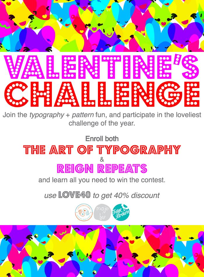
Valentines Challenge

Well if this post is not a review of some brilliant and awesome courses what am I going on about?
Ok, both Majo and Faye teamed up and came up with a Valentines Challenge
 The aim was to create a greeting card with a typographic element along with a matching gift wrap repeat pattern. I thought this sounded like fun and gave it a go. There are some lovely projects entered and now there is a public vote for your favourite. The deadline is the 17th with the winners announced on the 18th.
Have a look at all 8 projects here and vote
Saturday 8 February 2014
wow busy week so three posts
I didn't mention that this weeks spoonflower contest has an anti-Valentines day theme. Not only was you asked to create that expresses some Anti-Valentine's Day sentiments but also a design styled after a traditional cross stitch .
I went for a traditional colour palette of pinks and purples with heart motifs.
I'm really happy with how this turned out - If you like it please vote for it here

I went for a traditional colour palette of pinks and purples with heart motifs.
I'm really happy with how this turned out - If you like it please vote for it here
Tuesday 4 February 2014
Society6 promotion -
 Society6 have a couple of my designs including this one below. They are also doing free shipping which is great especially if you are not based in the USA. click on the link and you‘ll get FREE Shipping and $5 Off Kid's Tees and Baby Onesies on everything in my shop! :)
LINK
Promotion expires February 9, 2014 at Midnight Pacific Time. *Offer excludes Framed Art Prints, Stretched Canvases and Throw Pillows with insert.
Monday 3 February 2014
Design for Valentines Challenge
These are my designs for Valentines Challenge ran by Faye and Majo. They both have really brilliant courses on Skillshare and I have learnt so much. This challenge is fun because it was to design a card to match a gift wrap.


Let me know what you think. I'm really happy with how they came out and the card will be available through society6
and the giftwrap through spoonflower
and the giftwrap through spoonflower
Wednesday 29 January 2014
Year of the horse
To celebrate the Chinese New Year, Spoonflower asked for designs styled like a traditional Chinese paper cutting, using red and white only. It is the year of the horse so I incorporated this into my design. I also tried to keep it a continuous design to keep the style of a design cut from a piece of paper so no floating elements. I took inspiration from design elements in traditional papercuts. Please vote for it here

Wednesday 22 January 2014
Bright Coral
New fabric design for this week Spoonflower contest. I went for a simple layout with nice bright colours. The theme was Great Barrier Reef in celebration of Australia Day on January 26th . I had considered a dark green and gold yellow design but the reef is famous for the bright colours so seemed wrong not to acknowledge them. I thought about adding turtles, fish and other marine organisms but felt that the coral should be the star of the show. I also think that, as a simple design, it would work better as a dressmaking fabric too. Please vote here if you love this design.

In other news this week I have used this design to open a society6 shop. This means that this design can be bought in a range of ways from throw pillows to tote bags and phone/ipad skins. My favorite though is the note cards as I love all things stationery.
In other news this week I have used this design to open a society6 shop. This means that this design can be bought in a range of ways from throw pillows to tote bags and phone/ipad skins. My favorite though is the note cards as I love all things stationery.
 |
| Available from my shop http://society6.com/sarahpricedesigns |
Subscribe to:
Posts (Atom)